Showing posts with label magazine design. Show all posts

Friday, 25 June 2010

1980's magazine design

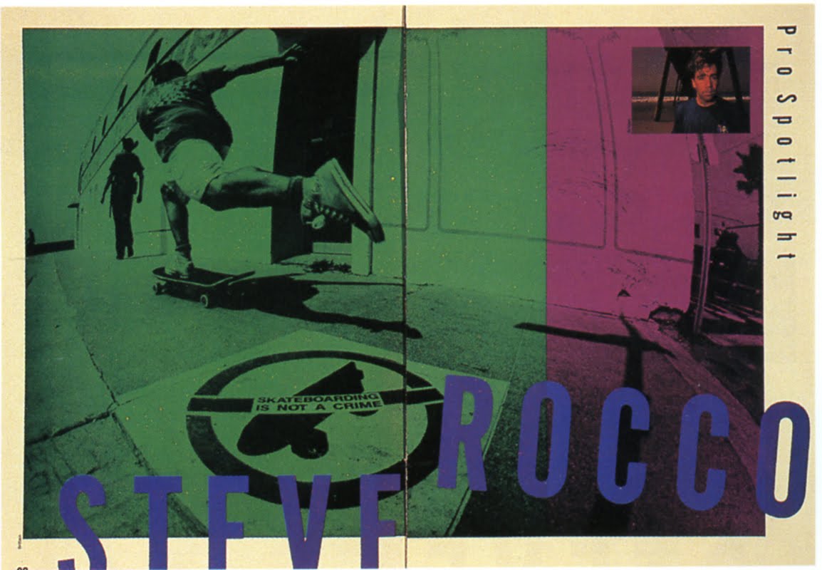
I picked up a copy of the SPD Annual from 1989 in a charity shop the other day. The eighties was such an overtly stylised decade that many of the spreads now look as incongruous as a Cyndi Lauper puffball skirt, so I can't pretend that much of the work has aged well, but nevertheless, in amongst the tics and tropes of the time—over-compressed and letterspaced capped serifs, leaderlines etc—there is some genuinely good stuff tucked away.

There's this for instance: remember the excitement when word began to spread about what David Carson was doing? Here he is, pre-Raygun, cutting through the crowd like a lightning bolt with Skateboard magazine from 1987. This is a clear statement of intent, and presaged much that was to come in the 1990s.


And here's another art director who was soon to become a household name: the late, great Tibor Kalman, pre-COLORS, with a powerful and witty pair of covers for Art Forum magazine, again from 1987.


And finally, from Life magazine and art directed by Charles Pates, an introduction to a certain young boxer, destined for great things…

Thursday, 24 June 2010

London Life


We featured this work last year in Creative Review, but I came across it again whilst tidying up, and it's so good that I think it really deserves another outing. London Life ran for eighteen months in the mid sixties, and was one of the first titles in which David Hillman—later to be known for Nova and his Guardian redesign—really came to attention.

That a magazine with such confident, bravura art direction and a creative team that included Duffy, Terence Donovan and Gerald Scarfe should sink without a trace can only give some idea of how fierce the competition must have been in those days.

Shown above are a selection of spreads and covers, plus the original, dummy cover, numbered 14th August.

Sunday, 13 January 2008

More Fact:


As promised, here is more of Fact:, the political magazine produced by Herb Lubalin and Ralph Ginzburg before they brought us Eros and Avant Garde. The typography was always austere, always authoritative—and, like the serious newspapers of the day—always black and white. Where Ginzburg departed from the newspaper editors of the day however, was in his willingness to run scandalous and outright libellous headlines, as here, in his outspoken attack on Bobby Kennedy. This issue came out in August 1964. By November Bobby's brother would be dead and such a headline would be unthinkable, as millions pinned their hopes to a young man who would himself fall to an assassin's bullet before the decade was out.

The back cover was used interchangeably, sometimes for small ads, sometimes as a contents page or sometimes as a longer issue flag, to highlight more stories. Two versions are shown here.

Wednesday, 19 September 2007

Fact


As a long-standing admirer of Herb Lubalin's work I'm delighted to finally get my hands on some copies of Fact, the magazine he created with Alan Ginzburg's brother Ralph after the short-lived but influential Eros.

Eros is a staple of graphic design compendiums but Fact is seldom seen, perhaps because the content largely consists of two-column articles interspersed by political cartoons, al a The New Yorker. Nevertheless Lubalin produced some excellent, typographic covers for Fact, all built around the idea of completing the sentence begun by the logo. I've just received these two copies through the post. I may post more when I receive them.